Best Fonts for Resume: Professional Choices to Make a Great First Impression
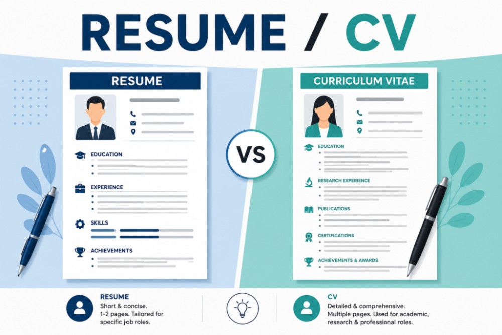
Your resume is often the first thing a recruiter sees, and its appearance can influence their first impression. While your skills and experience matter the most, choosing the right font can make your resume look professional, easy to read, and well-organized.
Many job seekers focus only on the content of their resume but overlook typography. A clean and readable font helps recruiters quickly find important information and gives your resume a polished look.
In this article, we’ll explore the best fonts for resumes, recommended font sizes, and formatting tips to help your resume stand out.
Why Does Font Matter in a Resume?
Recruiters often spend only a few seconds scanning each resume before deciding whether to continue reading. A clear and professional font helps them read your resume without difficulty.
Using the right font can:
- Improve readability
- Make your resume look professional
- Highlight important information
- Help Applicant Tracking Systems (ATS) process your resume
- Create a positive first impression
Avoid decorative or fancy fonts that may distract recruiters or make your resume difficult to read.
Top 10 Best Fonts for a Resume
- Calibri
Calibri is one of the most widely used resume fonts. It has a modern appearance and is easy to read on both screens and printed documents.
Best for: Corporate jobs, freshers, and experienced professionals.
- Arial
Arial is a clean, simple, and highly readable font. It works well across different industries and is compatible with almost every computer.
Best for: IT, engineering, administration, and business roles.
- Cambria
Cambria offers a slightly formal look while remaining easy to read. It performs well in printed resumes.
Best for: Academic, legal, and finance positions.
- Helvetica
Helvetica is known for its clean and elegant design. It gives resumes a modern and professional appearance.
Best for: Design, marketing, consulting, and corporate roles.
- Georgia
Georgia is a serif font that combines professionalism with excellent readability.
Best for: Education, publishing, writing, and research careers.
- Garamond
Garamond provides a classic and sophisticated appearance. It also saves space because of its compact letter design.
Best for: Experienced professionals and creative fields.
- Verdana
Verdana was designed for digital screens, making it highly readable even at smaller sizes.
Best for: Online job applications and technology-related careers.
- Tahoma
Tahoma has a clean and modern design with slightly narrower letters, helping fit more content without reducing readability.
Best for: Customer service, administration, and business positions.
- Trebuchet MS
Trebuchet MS offers a friendly yet professional appearance. It is suitable for applicants who want a modern-looking resume.
Best for: Sales, marketing, and communication roles.
- Times New Roman
Times New Roman remains one of the most traditional resume fonts. While it is still accepted, many recruiters now prefer more modern alternatives.
Best for: Government jobs, legal professions, and formal applications.
Recommended Font Size
Choosing the correct font size is just as important as selecting the font itself.
General recommendations:
- Name: 18–22 pt
- Section headings: 13–15 pt
- Body text: 10–12 pt
- Contact details: 10–11 pt
Keep font sizes consistent throughout the resume for a clean and organized appearance.
Fonts to Avoid
Some fonts may look attractive but are not suitable for professional resumes.
Avoid using:
- Comic Sans
- Papyrus
- Brush Script
- Curlz MT
- Jokerman
- Chiller
- Decorative or handwritten fonts
These fonts can make your resume appear unprofessional and difficult to read.
Resume Formatting Tips
In addition to selecting the right font, follow these formatting guidelines:
- Keep your resume to one or two pages.
- Use bold headings for each section.
- Maintain consistent spacing and margins.
- Use bullet points instead of long paragraphs.
- Leave enough white space for readability.
- Save your resume as a PDF unless another format is requested.
A clean layout is just as important as the content itself.
ATS-Friendly Font Tips
Many companies use Applicant Tracking Systems (ATS) to screen resumes before a recruiter reviews them.
To improve ATS compatibility:
- Use standard fonts like Calibri, Arial, or Cambria.
- Avoid text boxes and complex graphics.
- Use clear section headings such as “Education,” “Experience,” and “Skills.”
- Stick to simple formatting.
These practices help ensure your resume can be accurately scanned and parsed.
Which Font Is Best?
There is no single perfect font for every resume, but these are among the safest choices:
- Calibri – Modern and professional
- Arial – Clean and universally accepted
- Cambria – Formal and elegant
- Helvetica – Premium and modern
- Georgia – Excellent for traditional professions
Choose a font that matches the industry you’re applying to while keeping readability your top priority.
Conclusion
A well-written resume deserves a professional presentation. Choosing the right font improves readability, creates a positive first impression, and increases the chances that recruiters will spend more time reviewing your application.
For most job seekers, fonts like Calibri, Arial, Cambria, Helvetica, and Georgia provide an excellent balance of professionalism and readability. Combine a clean font with strong content, proper formatting, and an ATS-friendly layout to create a resume that stands out for the right reasons.